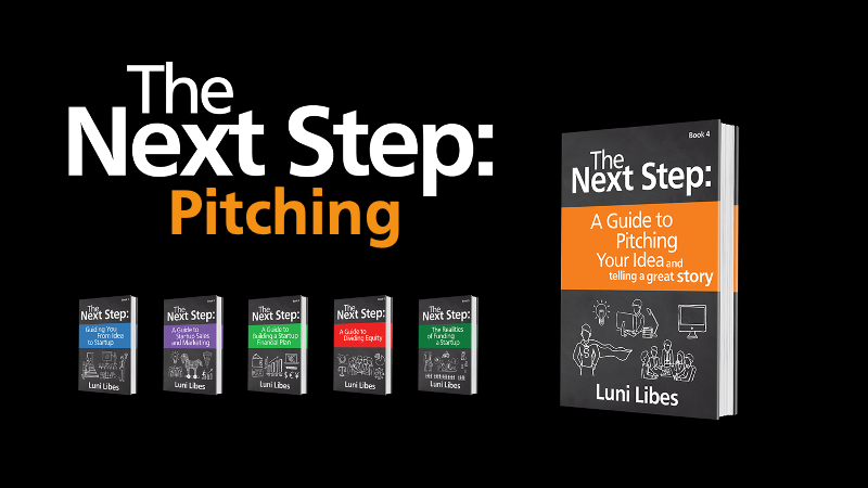
I wrote a whole book walking entrepreneurs through the process of creating a simple, compelling pitch deck.
Apparently most entrepreneurs don’t like to read any more than investors.
To provide an alternative, The Next Step: Podcast is running a series of episodes, one slide at a time. Below is the playlist for that series and below that, the slide deck I was referring to, along with as few words as possible. 🙂
Slide-by-slide
Slide 1
This is your first impression. Pick a great name. Spend a little money on a great logo.
Add a hint. Include the date, your name.
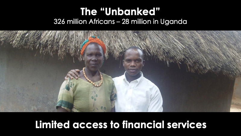
Slide 2, the Problem
Mostly images. One whole sentence at most.
Make sure your problem matches the scale of your solution (which comes later).
Slide 3, the Customer
Who has the problem?
Ideally, tell a real customer story. Or three. Worst case, explain the customer segment(s) via a persona.
Slide 4, the Wrong Solution (or Trend)
How are the customers solving this problem today?
OR… sometimes best is to show a trend that you are catching.
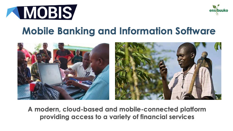
Slide 5, the Solution
The high-level description of the solution.
This one has two sides, thus two images, plus a half-sentence at the top and one whole sentence at the bottom, minimizing the number of words.
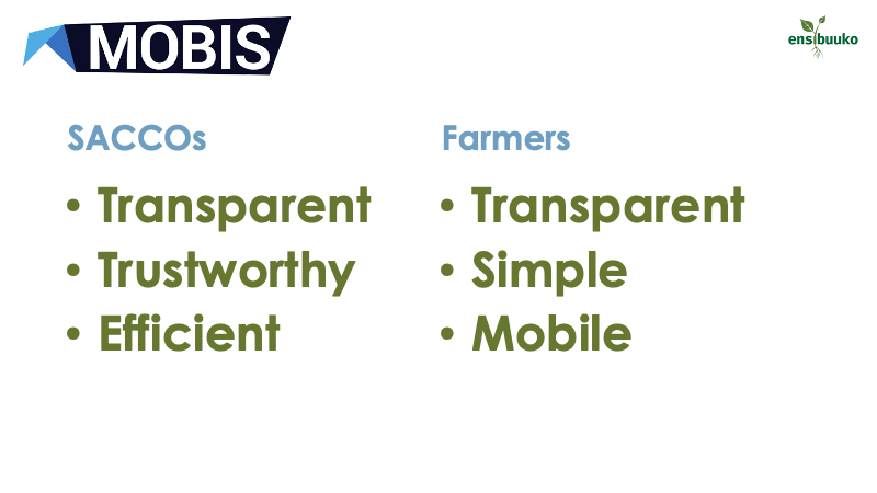
Slide 6, more details
Include at least one more slide of details on the solution.
This deck dives into benefits as that layer. This deck also dates back to before the solution was fully functional and pretty. Better today would be screen shots.
Slide 7, the Opportunity
Show off a big number.
Literally big, 80-200 point type.
Investors need to know that the opportunity is large enough to make them money.
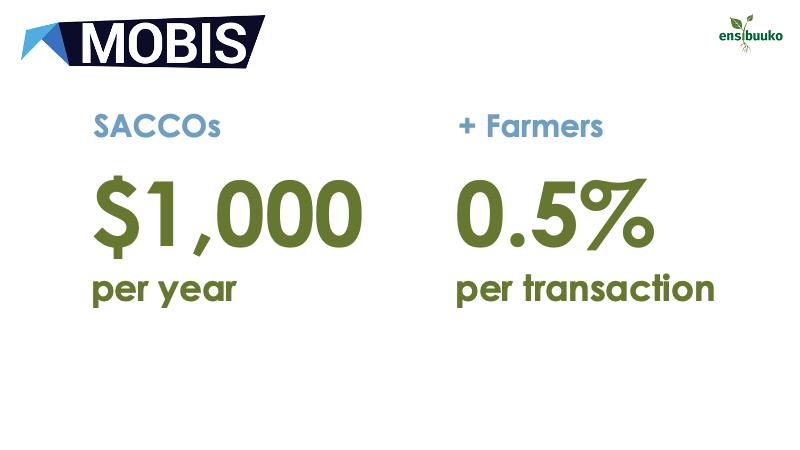
Slide 8, the Business Model
How does your company make money?
Who pays? How much do they pay? How often do they pay? Etc.
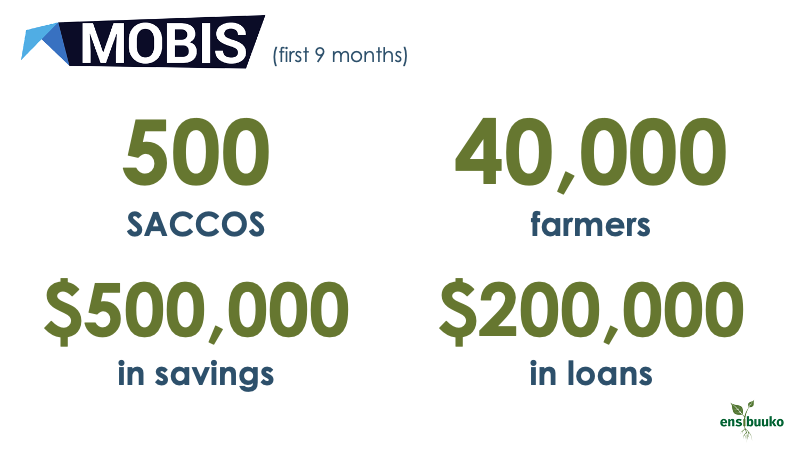
Slide 9, *** TRACTION ***
Investors no longer invest in ideas, they invest in ideas that are in the market, with customers, letting those customers prove that the solution is needed.
1, 2, 3, or in this case 4 KPIs.
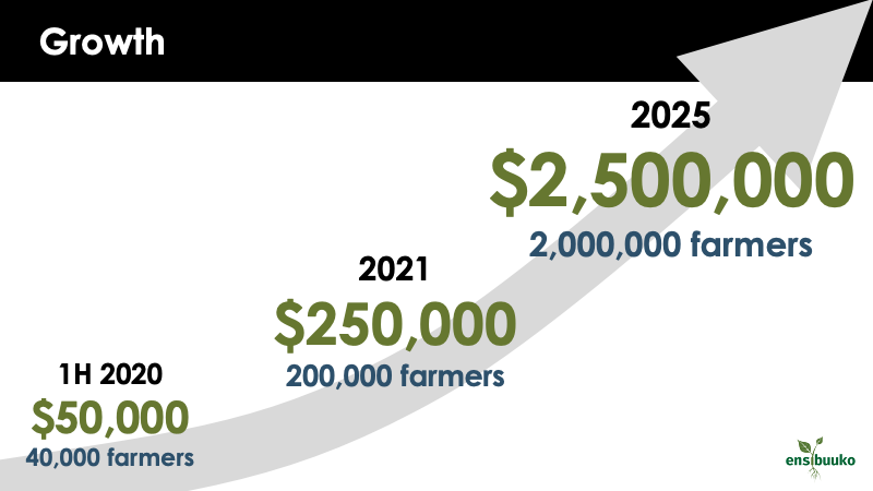
Slide 10, the Financials
Ideally both historic and future financial projections.
Ideally, a graph (Excel is fine vs. this fancy version).
Ideally, showing high, believable growth.
Showing when break-even is reached if this company isn’t already profitable.
df
Slide 11, the Team
“We have a great team!”
Headshots. Smiling. Like all the images, make sure they are clear, resized and cropped, not squished and warped.
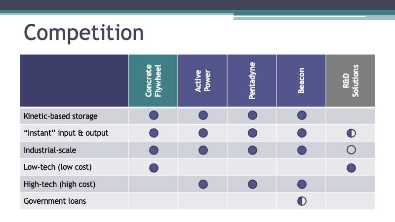
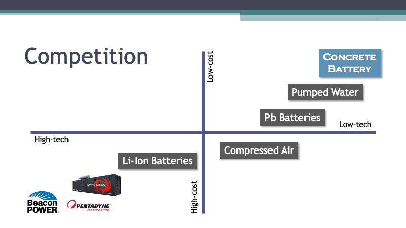
But wait… we missed the competition. For that you pick one of two designs: competitive matrix or magic square. Each have standards to follow. Break the standards or use another design at your own risk.
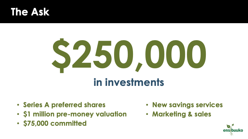
That is the end of the expected (initial overview) pitch deck, but that isn’t end of your work. You also need a slide for every important question asked in Q&A, and you need to know how to get to that slide without scrolling.
The flow and framework above isn’t the only way to pitch. Sequoia Capita has a slightly different flow. Click the image above to see that alternative, slide by slide.

