An oft-repeated advice to startups is to fret over your name and logo. It’s the first impression you make with customers, potential hires, investors, and everyone else.
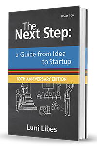
Over on Fledge’s blog is a video (below) showing off examples of how we’ve done this at Fledge. Some of the “after” logos were my designs, some by professional designers. For the Fledge logo, the logo for Realize Impact (my nonprofit), Africa Eats (my holdco spin-off), and the original book cover for The Next Step, I personally turned to 99designs.com.
Here’s how you make the most from 99designs:
1. Use google to find a discount code. Sometimes they have a “free power pack”, in times past I found this on F6S.com.
2. Set up a logo campaign, but when they ask if you want the basic package or a more expensive package, find the small link for “custom” and set the price at $305. That sets your campaign above the masses who pay the $299 basic price, and only costs you $6 extra. The discount code should give you some add-ons for free. The higher price will get you more designs, and the power pack will make your contest seen by more designers, leading to even more design options.
3. In the brief, beyond picking examples you like, upload a few logos from existing companies that you really like. Many of the artists will ignore this, but if some don’t. You’ll get a better logo and more options that fit your taste if you start the designers with some ideas.
4. As the designs flow in over the next 24 hours, pop over to the campaign 2-3 times per day, and provide feedback to the artists. Tell them what you like and what you don’t like. Ask them for revisions that may make the logo better. The more you interact, the more designs you’ll get.
5. Do not rate any of the designs until you have at least 20, then rate all the designs, but do not give any design less than three stars. I typically use three stars for “don’t like”, four stars for “good” and save the five star rating for the tiny handful that are outstanding. Other artists will copy anything that is five stars, and artists will get discouraged and leave if they get one or two stars.
6. As soon as the first round of designs ends (72 hours after you start it), send out a poll to your stakeholders. The results will likely surprise you.
7. In the second round, visit the campaign even more often, providing more feedback. You only get 72 more hours of revisions and most of the artists are overseas, and thus far from your home timezone.
8. Do a final poll to double check the winner before you pick one.
9. Expect some last minute designs at the end of each round, especially the very end. The Fledge bird showed up 35 minutes before the contest ended. It was heads and shoulders above the other choices.
Once, for Obamastove, we had the winning design on Day 2 and stopped this process early, in the midst of step 5. If you find something spectacular (and it happens), don’t waste the other designers time.
The last time I used this process, I received over 120 design choices. Some were not great fits for the company in question, but two of the other designs fit two of my fledglings. We ended up with three logos in one contest! We must not be the first case like this, as 99designs let you buy as many of the designs as you like.
And that’s it. Enjoy the process!


