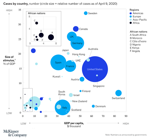
McKinsey latest report on the pandemic response in Africa includes this very interesting chart of the size of the government responses to the pandemic as a percentage of GDP:

It is interesting as South Korea and Italy both spent very little, with vastly different outcomes. It is interesting as if there is any correlation here, it is that the smaller the outbreak, the less spent on stimulus.
Thus for all those people clamoring about “the cure can’t be worse than the disease” what they are missing is that the economic cure is to minimize the disease.
Meanwhile, this is also a good time to remind everyone how much bigger the U.S. GDP is than the rest of the world. The McKinsey chart shows a bigger bubble for the U.S., but that is due to the size of our outbreak, not the size of our economy.

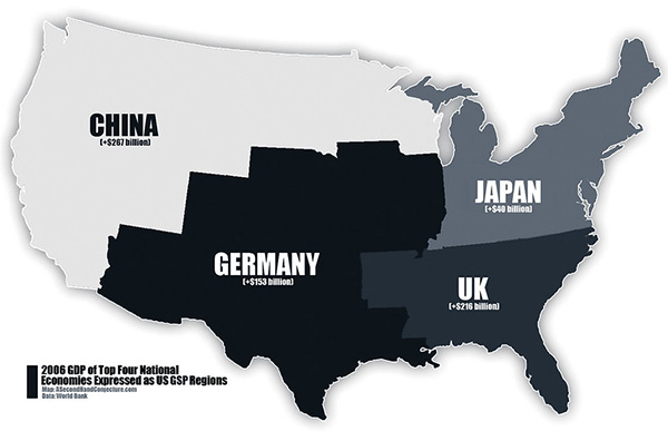
The U.S. economy is bigger than the next four biggest economies combined. At least it was in 2019. We’ll see in nine months what happens to the GDP in 2020. Those numbers will not be pretty.


