Since exponential growth isn’t intuitive, it is difficult to grasp how fast epidemics spread and how small changes can lower that speed.
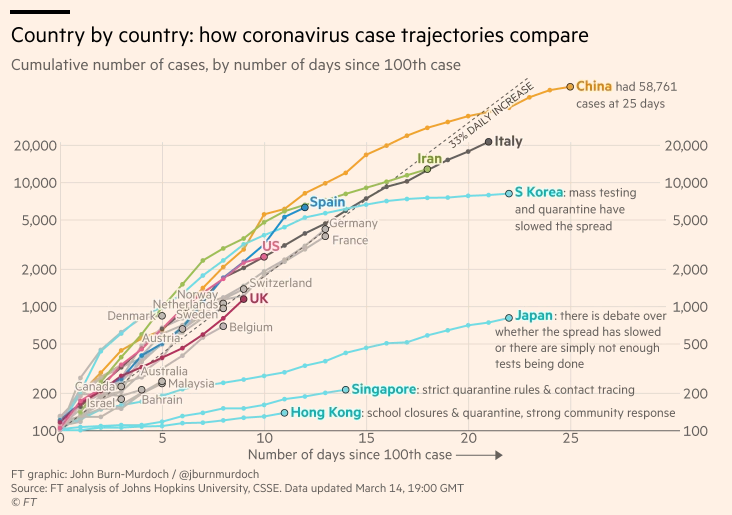
This weekend the Financial Times published the following chart. It shows how all but four countries have outbreaks growing at similar rates.

Note this chart isn’t showing each country starting on the same day, but instead showing each country starting on the day when they had 100 official positive cases. From that point, except in South Korea, Japan, Singapore, and Hong Kong, the epidemic is growing at 33% per day (which means doubling every 3-4 days and growing tenfold every 8-9 days).
Why are the curves lower in Hong Kong and Singapore? Because the density of the countries make it commonplace for the government to order people to stay home, and the people comply. Same in South Korea except that it took them a bit longer to get that started.
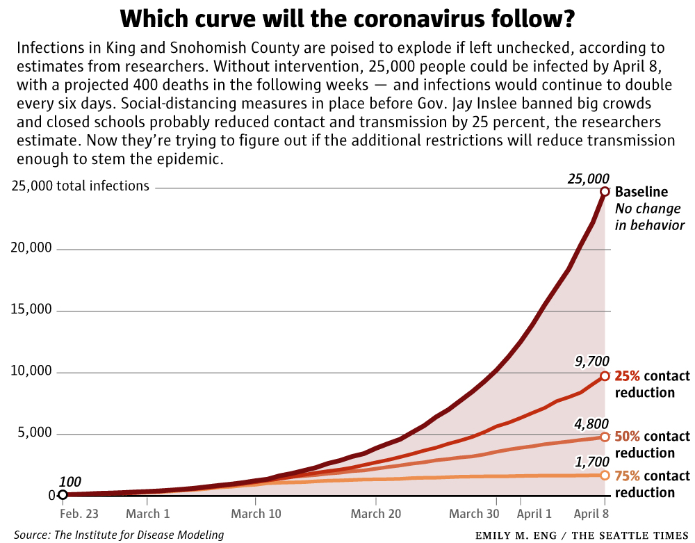
Now compare those curves with this graph from this weekend’s Seattle Times:

The FT graph is logarithmic where this one linear, but the point here is that the baseline 33% growth PER DAY can be cut by almost 2/3rds if just 25% of the population stays home, or cut by 80% if half of everyone stays home, or we could potentially replicate South Korea’s slowing expansion of their outbreak if 75% of everyone stays home.
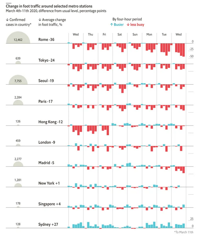
And below is a graph showing that people are already doing this:

So unless you are a healthcare worker, or working on an essential service like electricity, water, sewage, garbage, police, fire, supermarkets, or trucking to keep these service running. STAY HOME!


