
I am a visual thinker. I am able to understanding what a given number means when analyzing a spreadsheet, but I cannot easily visualize whether the numbers as a whole are a good story or not.
However, since a financial plan is a “time series” of values, those values can easily be plotted on a chart, and a chart lets me quickly determine whether a financial plan is reasonable or not.
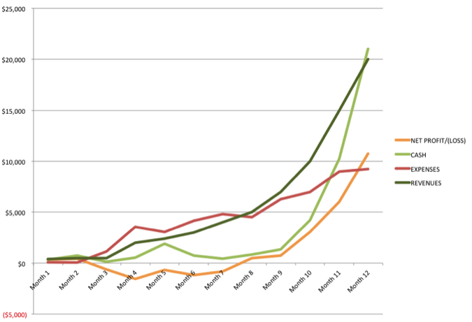
The above Financial Summary Chart visualizes the lemonade financial plan, with the revenues, expenses, net profit/loss, and cash as separate lines. Here is what I see within this chart.
Revenues are steadily growing, projected into a very smooth exponential curve. Real-world revenues are rarely that smooth, but this is what you are aiming for. For a financial plan, this is a good shape for Year 1, with no abrupt changes that would need further explanation.
Expenses are bumpier but not too bumpy. Expenses tend to be less smooth, as they include investments, which can make the graph spike upwards.
To see if a company is viable, look at where the revenues cross over the expenses. Since most companies lose money for a while, the expenses will start out higher than the revenues. To make money, the revenues must grow faster than expenses grow; at some point, those two lines cross.
In this chart, that crossover is clearly visible in Month 8. The same information is also visible from the net profit/loss line, which dips below the $0 mark (meaning losses), and then pops back to positive (profits) in Month 8.
Looking further at the net losses, note how shallow that dip below $0 is, as compared with the revenues and expenses. If this were a business that required a lot more upfront expenses, the net loss line would drop much lower.
What I also see from the net profit/loss line is that this business runs near break-even until Month 10, and then the profits take off dramatically. That makes me wonder how it might be possible to speed up that initial period of growth to less than ten months, in order to make the plan better. It also makes me wonder what happens in Month 10 of the plan that might not happen in reality. For example, it may be that the expenses are accurately estimated for the first nine months and then underestimated beyond that.
Lastly, let’s look at the line that charts the cash on hand. The key is that this line can never go below $0, because that would mean the company runs out of cash. With this chart, I can see clearly how the financial plan has no cushion for nine months. Thus, in reality, if the revenues do not “meet the projections” (i.e., they fall short) or if the expenses are higher than expected, this business will likely run out of cash. That would be bad. Remember, if you run out of cash, your company dies.